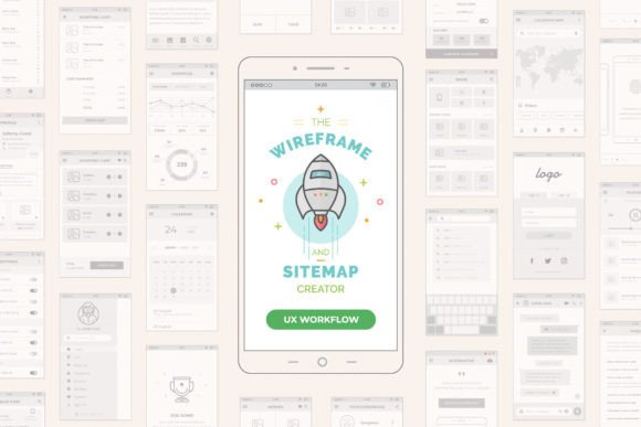
Mobile Wireframe and Sitemap Creator: A Practical System for Real-World App Design
If you have ever tried to explain a mobile app idea to a developer, client, or team member using only words or rough sketches on a napkin, you know the frustration that follows. Misunderstandings pile up, features get misinterpreted, and the final product rarely matches the initial vision. This is exactly why I developed my own Mobile Wireframe and Sitemap Creator. It is not just another template; it is a system tested and improved through years of challenging professional work. After deep research using several existing systems, I finally opted to create my own with many ideas in mind to improve the entire process. Now, I share it with you, and it is at your complete disposal.
This system concept is based on its web brother version, the UX Workflow - Wireframe and Sitemap Creator, which launched two years ago with thousands of downloads around the world and was nominated on specialized design sites. That success proved that designers need structure without rigidity. The mobile version is intended to be the perfect extension for your mobile app projects, bridging the gap between abstract ideas and tangible, buildable interfaces.
Why Structure Matters Before You Start Designing
Many creators jump straight into high-fidelity design tools like Figma or Sketch, picking colors and fonts before they have even decided where the "Back" button should go. This is a common mistake. The Mobile Wireframe and Sitemap Creator forces you to slow down and focus on architecture first. In the download, you will get a Mobile Screen Platform Grid System, included inside, where you can drag and drop tons of UI elements provided in this template for creating precise and beautiful wireframes.
All elements are in real standard dimensions, based on the 8-Point Grid principles. This allows you to create quickly and consistently, with fully resizable vector formats that are easy to adapt to your creative needs. But why does the 8-point grid matter? Because it aligns with how most modern development frameworks handle spacing. When you design using this system, you are not just making pictures; you are creating a blueprint that developers can actually use. This reduces back-and-forth questions later in the project lifecycle.
Real-World Use Cases for Different Professionals
The beauty of this system is its versatility. It is not limited to senior UX designers at large tech firms. Here is how different users can apply it in their daily work.
For Freelancers and Small Agencies
When you are pitching to a new client, time is money. You cannot spend weeks on discovery before showing value. With this tool, you can map out a basic sitemap and key screens during the initial consultation. Imagine sitting with a restaurant owner who wants an ordering app. Instead of promising vague results, you drag and drop a menu screen, a cart, and a checkout flow right in front of them. This visual confirmation builds trust instantly. It shows you understand their business logic, not just their aesthetic preferences.
For Entrepreneurs and Startup Founders
If you are building a minimum viable product (MVP), you need to prioritize features ruthlessly. The innovative Mobile Sitemap Grid System allows you to drag and drop wireframes with exactitude to create a hierarchical view of your app. You can visually see if your user journey has too many steps. If it takes five taps to sign up, you will see it clearly on the sitemap. This helps you cut unnecessary friction before writing a single line of code, saving significant development costs.
For Educators and Students
Teaching UX principles can be abstract. Students often struggle to understand information architecture. This system provides a tactile way to learn. By physically arranging screens and connecting them, learners grasp the concept of user flow intuitively. It serves as an excellent teaching aid for courses on mobile interaction design, allowing students to experiment with layout and navigation without getting bogged down by complex software learning curves.
Beyond Wireframing: The Power of the Sitemap Grid
This is amazing, but not the end of the party. Most tools treat wireframes and sitemaps as separate entities. You draw screens in one file and map connections in another. This disconnect leads to errors. My system integrates both. You will also download an innovative Mobile Sitemap Grid System, where you can drag and drop the wireframes with exactitude to create a comprehensive navigation map.
This integration ensures that every screen in your sitemap has a corresponding wireframe, and every wireframe fits logically into your sitemap. It creates a single source of truth for your project. For marketers and product managers, this clarity is invaluable. You can trace the user’s path from acquisition to conversion, identifying potential drop-off points early in the process.
What to Consider Before Using This System
While this tool is powerful, it requires a shift in mindset. You must be willing to embrace constraints. The 8-point grid and standard UI elements are there to guide you, not limit you. If you are used to free-form drawing, the initial transition might feel restrictive. However, this restriction is precisely what speeds up the process. By removing the infinite choices of pixel-perfect positioning, you focus on functionality and flow.
Also, consider your collaboration style. This system works best when shared early. Do not wait until the wireframes are "perfect." Share the sitemap with your stakeholders to validate the structure. Share the low-fidelity wireframes with developers to check technical feasibility. The vector formats ensure that these files remain lightweight and easy to share, unlike heavy design prototypes that require specific software versions to open.
Making the Process Efficient and Consistent
Consistency is often the hardest part of mobile design. Buttons vary in size, margins shift unexpectedly, and alignment drifts. Because this system is built on vector formats and strict grid principles, consistency is automatic. When you duplicate a header component, it is identical to the previous one. When you resize a content block, it snaps to the grid. This attention to detail elevates the perceived quality of your work, even in the early stages.
Furthermore, the drag-and-drop nature of the UI elements means you are not reinventing the wheel for every project. Common patterns like login forms, profile settings, and feed layouts are ready to use. You can customize them to fit your brand, but the underlying structure remains solid. This allows you to iterate faster. You can test three different navigation structures in the time it usually takes to design one static screen.
Final Thoughts on Streamlining Your Workflow
The goal of the Mobile Wireframe and Sitemap Creator is not to replace your creativity but to support it. By handling the structural heavy lifting, it frees you to think about the user experience, the business goals, and the unique value proposition of your app. Whether you are a solo freelancer trying to impress a client, a startup founder validating an idea, or an educator teaching the next generation of designers, this system offers a reliable foundation.
It represents years of refinement, born from the need for a better way to work. It connects the dots between strategy and execution, ensuring that your mobile app projects start on the right foot. Download it, explore the grid systems, and see how a structured approach can transform your design workflow from chaotic to clear.